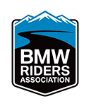
After thirty years, the BMW Riders Association has a new club logo! Discussions started well over a year ago at the Board level to update the club’s branding after a redesign of the magazine that you hold in your hands now. After updating and modernizing the layout of On The Level in the March/April 2018 issue, it became clear that the club’s logo needed revisiting as well.
The old logo served the club well but was not really communicating what the club was about: motorcycling. And adventure. With the mission set, concepts were initiated in the fall of 2018. Various avenues were taken, some with illustrations of bikes, some that honored the Black Eagle and others that were text driven. Eventually, after multiple rounds with both the Marketing Committee and the larger BMW RA Board, a design was chosen. Special thanks to board member Hans Rosenstein for pushing back on some early drafts to push even higher. The goal was to be memorable, easily identifiable as a BMW motorcycle club and conveying adventure. This Design Analysis explains the design decisions arrived at what you see here.
 The addition of the alternate logo required for approval with the BMW Club Council in Germany. Specific design criteria were required for the “business card” version. Many design elements of the card will be immediately familiar – the use of the BMW Roundel, the text above and the two vertical lines framing the logo. This card logo will be used sparingly. The main logo, which we are calling the “signet,” will be our new club logo used in all things, from print to web to merchandise. Speaking of merchandise, the Board is currently exploring new options for club swag. We are trying to find the right mix of variety and fulfillment. Look for news on this in the coming months.
 So that is it on the new logo. Thank you to all that were involved, including your constructive criticism. The Board hopes that you like what you see here.
– Chris Parker, OTL Art Director, RA 44070
